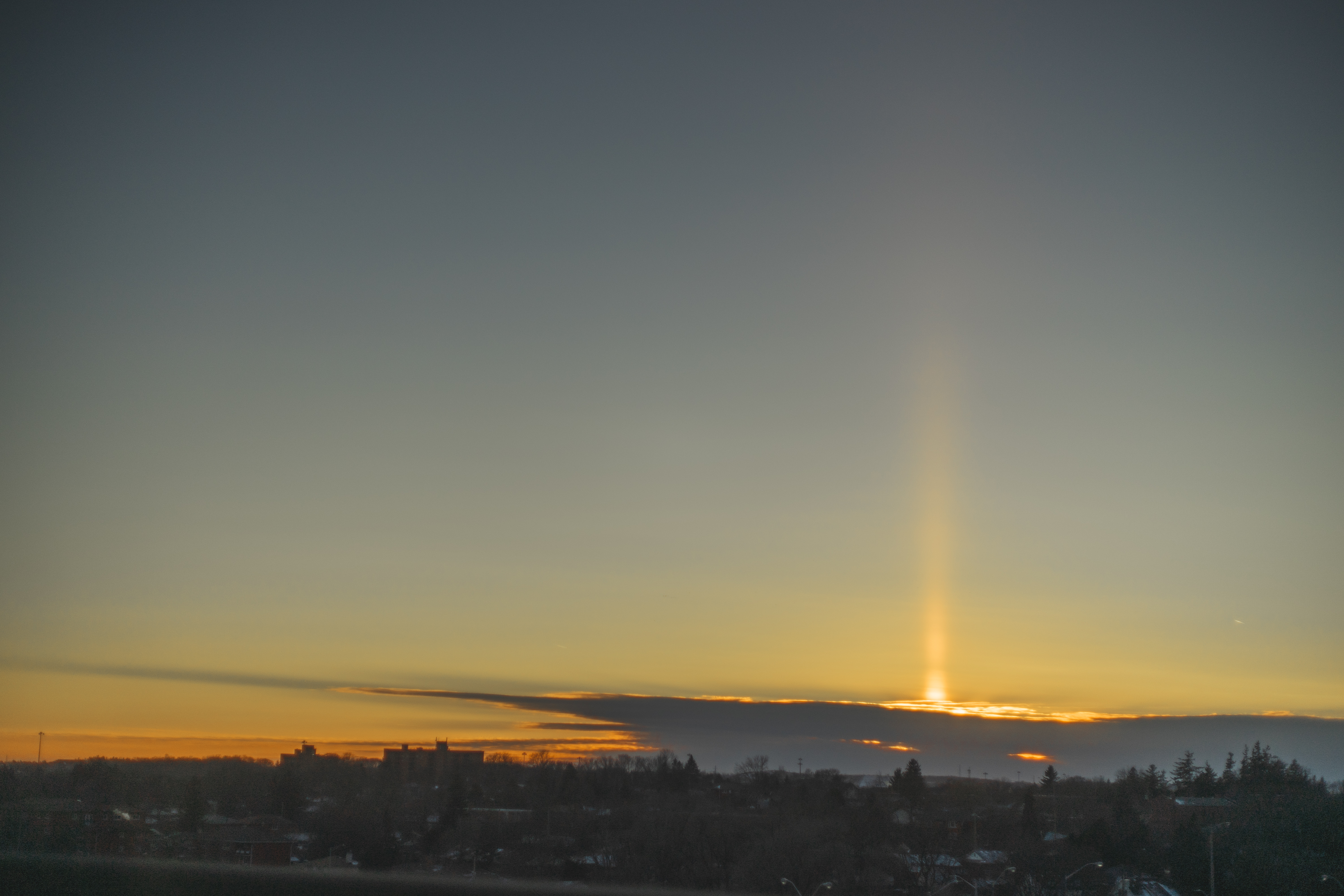
Sun Pillar
Metadata
Personal Critique
I actually just really like this photo just for its serendipity – it’s always fun getting uncommon natural effects. The actual composition and landscape isn’t even anything special, just kinda got lucky that the clouds at least cast an interesting shadow to the left. I feel like the top left bits of the image may be a bit empty, but I also kind of like it that way because it puts the focus solely on the sun pillar. It would’ve been worse if there was a bit of cloud there – ideally it would either be a perfectly clear sky as it is here, or a busier and stormier sky. In terms of postprocessing, I may have lifted the horizon clouds a bit too much, and I don’t like the halo-ing around the trees in the bottom right (though I’m fairly certain I didn’t even push sharpening at all). I like the colour gradient that I managed to pull from the sky – tried to keep it as true to life as possible. I could’ve pushed more dramatic, unnatural colours, but I feel treating the image the way I did respects the phenomena better.